

January 14, 2026
Avoid 5 common website mistakes that scare away high-ticket clients. Ensure your mobile view is flawless, loading is fast, and CTAs are clear. Learn more!
Let's be honest, your website is often the first handshake you give to a potential client. If that handshake is weak or awkward, they're likely to walk away before you even get a chance to impress them. We've all been there, bouncing off sites that are confusing, slow, or just plain unprofessional. This article, "5 Website Mistakes That Are Scaring Away High-Ticket Clients (Check Your Mobile View Now).", is here to help you avoid those pitfalls. We'll look at common errors that might be costing you valuable business and how to fix them.
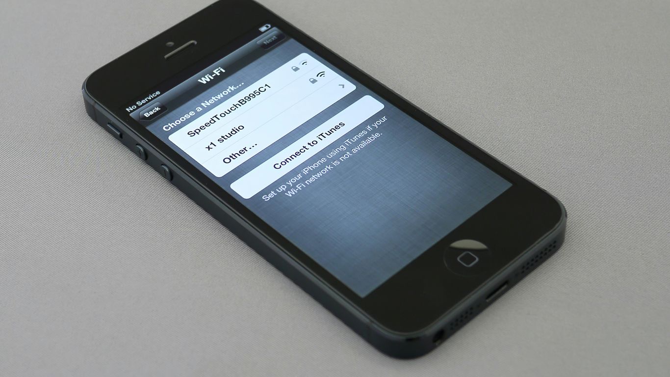
Let's be honest, most people check websites on their phones these days. If your site looks clunky or is hard to use on a smaller screen, you're probably losing clients before they even get a chance to see what you offer. Your website needs to work perfectly on every device, or you're leaving money on the table.
Think about it: when you're on the go, you want information fast and easy. A site that requires a lot of pinching and zooming, or has buttons too small to tap, is just frustrating. This isn't just about looking good; it's about making it simple for potential clients to find what they need and take the next step. Google even prioritizes mobile-friendly sites in its search results, so if your site isn't optimized, you might not even show up for people searching on their phones. It's a pretty big deal for your online visibility.
Here’s what you should check:
Taking the time to ensure your site is mobile-friendly is a smart move. You can find some great mobile website design examples to get ideas. It shows you respect your visitors' time and makes it much easier for them to become customers.
You know that feeling when you click on a link and then just… wait? And wait some more? It’s incredibly frustrating, right? Well, that’s exactly what potential high-ticket clients experience when your website takes too long to load. In today's fast-paced digital world, patience is a rare commodity, and a slow website is a surefire way to lose business.
Research shows that a significant portion of mobile users, around 53%, will leave a page if it takes longer than three seconds to load. Think about that – over half of your potential clients could be gone before they even see what you have to offer. And for those who do stick around, every extra second of load time can decrease your conversion rates. It’s a real problem that directly impacts your bottom line.
What causes these sluggish speeds?
If you're unsure about your site's speed, you can use tools like Google's PageSpeed Insights to get a clear picture. Anything scoring below 70 needs your attention. Addressing these issues is not just about good user experience; it's about making sure your site is accessible and welcoming to everyone, especially those who might be looking for premium services.
A slow website doesn't just annoy visitors; it actively drives them away. It signals a lack of professionalism and attention to detail, qualities that high-ticket clients are unlikely to overlook. Investing in speed optimization is investing in your credibility and your ability to capture valuable leads.
You know that feeling when you land on a website and you're just left hanging, unsure of what to do next? That's the direct result of a missing or unclear call to action (CTA). Your website should act as a guide, gently leading visitors toward the next logical step. A vague button or a weak phrase simply won't do; clarity is paramount in prompting action.
Think about it: have you ever encountered buttons that are as mysterious as a plot twist in a novel? Phrases like 'Click Here' leave users guessing. Are they getting a free trial, a valuable download, or perhaps a trip to the moon? If your visitors have to guess, you're risking them leaving your site altogether. A specific and compelling CTA is like a bright signpost, clearly indicating the path forward and sparking the desire to click.
It's also possible to overwhelm visitors with too many choices. A page cluttered with multiple CTAs can be paralyzing. It's better to focus on one irresistible offer that truly matters. This singular focus will have a far greater impact than bombarding your audience with a dozen lukewarm invitations. When your primary CTA shines, it acts like a lighthouse, guiding users through any potential fog.
Consider the common 'Submit' button on forms. It often evokes about as much excitement as watching paint dry. Imagine, instead, if that button promised something more enticing, like 'Get My Free Guide' or 'Join Our Community'. This approach injects energy and anticipation, drawing users in and making them eager to see what awaits them. Your CTA should stir emotion and create a sense of excitement, making the next step feel like an adventure.
Most visitors aren't ready to commit immediately. It's perfectly normal for people to need more time before making a decision. This is where a secondary call to action becomes incredibly useful. A secondary CTA can capture an email address by offering valuable content, like a downloadable resource, in exchange. This lead magnet keeps the conversation going and allows you to nurture potential clients over time. You can then guide them gently through an automated sequence, ensuring they don't miss out on what you have to offer. This strategy helps build relationships and moves prospects closer to becoming high-ticket clients.
Here's how to place your CTAs effectively:
A website without a clear call to action is like a store with no checkout counter. Visitors may browse, but they won't buy if they don't know how. Make it obvious what you want them to do next.
Your website's appearance is the very first impression a potential high-ticket client gets. If it looks messy, outdated, or just plain unprofessional, they're likely to click away before you even have a chance to show them what you can do. Think about it: would you trust a luxury brand with a website that looks like it was built in the early 2000s? Probably not. A clean, modern, and well-organized design signals competence and attention to detail, qualities that high-paying clients actively seek.
Consider these common design missteps:
It's not just about looking pretty, either. A poorly designed site can be difficult to use, leading to frustration. For instance, if your contact form is hard to find or doesn't work correctly, you're losing potential leads. Examining the internet's worst websites can offer valuable lessons in design and user experience. By analyzing examples of poor design, creators can better understand what to avoid, ultimately leading to improved website development and a more positive user journey. Remember, your website is a reflection of your business, so make sure it's one that inspires confidence and professionalism. Optimizing images by compressing them, utilizing formats like WebP for better efficiency, is a simple step that can make a big difference in how your site looks and performs. Avoid common website pitfalls like slow performance, cluttered layouts, and outdated interactions that harm conversions and credibility.
You might think using fancy business terms makes your company sound more professional, but for high-ticket clients, it often does the opposite. When your website is filled with words like "synergy," "leverage," or "optimize," you risk sounding out of touch or, worse, like you're trying too hard to impress. Your website should speak the language of your clients, not a corporate dictionary.
Think about it: your potential clients are busy. They're looking for clear solutions to their problems, not a puzzle to decipher. If they land on your site and are met with a wall of jargon, they'll likely leave. They want to understand what you do and how you can help them, quickly and easily. Using plain, direct language is key to building trust and showing you understand their needs. It's about making a connection, not showing off your vocabulary.
Here's what to watch out for:
Consider this: many businesses waste significant amounts of money on ineffective marketing channels. Understanding your ROI is vital, and clear communication on your website is the first step to showing clients you're a smart investment. If your site's message is muddled by jargon, clients might assume your business practices are equally unclear.
When in doubt, always choose simplicity. Your goal is to be understood, not to win a word game. Clear communication builds confidence and makes it easy for clients to see the value you provide.
Instead of saying "We leverage synergistic paradigms to optimize client outcomes," try something like "We help clients achieve better results through teamwork." It's direct, understandable, and shows you're focused on their success. This clarity is what attracts and keeps high-value clients. Make sure your website clearly labels everything without using jargon.

Imagine walking into a store where the aisles are a jumbled mess, and the signs point everywhere and nowhere. That’s what a website with confusing navigation feels like to a potential client. If your visitors can’t easily find what they’re looking for, they won’t stick around to figure it out. They’ll just leave, and likely, they won’t come back.
Your website’s structure should be intuitive, guiding users effortlessly from one point to the next. Think about how you want someone to move through your site. Do you want them to learn about your services, see your portfolio, and then contact you? Make that path crystal clear. A cluttered or illogical menu system is a major turn-off for high-ticket clients who value their time and expect professionalism.
Consider these common navigation pitfalls:
When your site’s navigation is clear and simple, visitors can quickly access the information they need, building trust and encouraging them to take the next step. Exploring effective website navigation examples can provide inspiration for creating a user-friendly experience that keeps clients engaged.
A well-organized website demonstrates that you respect your visitors' time and understand their needs. It’s a subtle but powerful signal of your business's overall competence and attention to detail.
When you're asking for a significant investment, people need to feel secure. Without clear indicators that your business is legitimate and reliable, potential clients will hesitate. Think of trust signals as the handshake and eye contact of your website; they build immediate confidence. If your site feels like a stranger in a dark alley, they'll simply walk away.
What exactly are these signals? They're the little things that tell visitors, "You're safe here, and we're the real deal." This can include things like:
Displaying these elements helps build authority and transparency, which is especially important when selling high-ticket items. It's about showing you're not just another faceless entity online. Consider adding client logos from reputable companies you've worked with; this provides powerful social proof. You can also showcase any awards or certifications you've earned to further solidify your standing. These elements work together to make visitors feel more comfortable and confident in their decision to engage with you. For e-commerce, trust badges are a must-have to reassure customers about security and returns [5abb].
Visitors are bombarded with information and offers online. They need quick, clear indicators that your business is trustworthy before they commit their time or money. Failing to provide these signals is like showing up to a crucial meeting unprepared.
Don't underestimate the power of a well-placed testimonial or a recognized security badge. These aren't just decorative; they are functional components that directly impact conversion rates. Make sure your website actively works to build that confidence [a040]. Showing you've successfully helped others, perhaps through case studies or detailed client success stories, can be incredibly persuasive. It demonstrates you understand their needs and can deliver results. Building this trust is a key step in converting a curious visitor into a paying client [bb27].

Your website's content is the first real interaction a potential client has with your business. If it's not clear, engaging, and focused on their needs, they'll likely leave. Think about it: are you talking about yourself, or are you talking about how you can solve their problems? High-ticket clients are looking for solutions and expertise, not just a list of what you do.
Your content needs to speak directly to the pain points and aspirations of your ideal client. Instead of listing features, focus on the benefits. For example, saying "We offer advanced analytics integration" is less impactful than "Gain clear insights into your customer behavior to make smarter business decisions." It's about showing them the outcome, not just the process.
Here's how to make your content work harder for you:
Visitors can spot generic, uninspired content from a mile away. It suggests a lack of effort and understanding of their needs. Make your content unique, relevant, and genuinely helpful to stand out.
Remember, your website content is a conversation starter. If it's poorly written or irrelevant, that conversation never begins. Investing in quality content is a direct investment in attracting and converting those high-value clients. You might even consider how a strong content strategy can help you increase your prices over time.
You've likely spent a lot of time perfecting what your business does. You know all the technical details, the specifications, and the unique ways your product or service operates. But here's the thing: your potential clients probably don't care about that as much as you think. They're not looking for a technical manual; they're looking for a solution to a problem they have. When you list features, you're telling them what you do, but when you talk about benefits, you're showing them how you'll make their life better.
Think about it like this: if you're buying a new car, do you want to hear about the exact torque of the engine or how smoothly it drives on a long road trip? Most people want the latter. They want to imagine themselves enjoying the experience, not deciphering engineering specs. High-ticket sales often involve a significant investment, and clients want to be sure that investment will pay off in tangible ways. They want to know the outcome.
Here’s a simple way to reframe your thinking:
When you focus on benefits, you connect with your audience on a more personal level. You show them you understand their needs and can provide a positive outcome. This approach is far more persuasive than simply listing technical details. It helps potential clients visualize the value they will receive, making them more likely to move forward with your services. Remember, people buy solutions and transformations, not just products or services. Make sure your website clearly communicates the why behind what you offer, not just the what. This clarity is key to attracting and converting those valuable leads, so consider how you're presenting your value proposition.
Your website should speak directly to the desires and pain points of your ideal client. If you're listing features, you're speaking a language they might not fully understand or connect with. Shift your focus to the positive changes and improvements your business brings, and you'll find your message lands much more effectively.
You might think your website is just a digital brochure, but it's also a place where sensitive information is exchanged. If you're not paying attention to security, you're essentially leaving your digital doors wide open. This isn't just about protecting your business; it's about protecting your clients.
Think about it: people are entrusting you with their personal details, payment information, and other private data. If that data gets compromised because your site wasn't secure, the damage to your reputation could be immense. High-ticket clients, especially, are very aware of these risks. They expect a certain level of professionalism and safety, and a lack of security signals can make them look elsewhere.
A "Not Secure" warning in the browser is a major red flag that will send potential clients running. Google even flags sites without proper security, which hurts your visibility and your credibility.
Here’s what you absolutely need to address:
Ignoring these measures is like inviting trouble. It's not a matter of if a security issue will arise, but when. Investing in website security measures upfront is far less costly than dealing with the fallout of a data breach or a hacked site.
Ignoring website security can lead to big problems. It's like leaving your front door unlocked for anyone to walk in. Don't let your online business become an easy target for hackers. Protect your valuable information and keep your customers safe. Visit our website today to learn how we can help secure your digital space.
So, you've seen the common pitfalls that can make potential high-ticket clients click away faster than you can say "expensive mistake." Your website is your digital storefront, and frankly, it needs to look the part. If it's clunky on mobile, overloaded with jargon, or just plain confusing, you're not just losing visitors; you're losing serious business. Take a hard look at your site, especially on a phone, and ask yourself if it's truly inviting the kind of clients you want. Making these fixes isn't about chasing trends; it's about building a professional, clear, and trustworthy online presence that speaks directly to the clients who can afford your best. Get it right, and watch those high-value opportunities come your way.
Most people browse the internet using their phones these days. If your website looks messy or is hard to use on a phone, visitors will likely leave without looking at what you offer. Google also pays close attention to how well your site works on mobile when deciding where to rank it in search results.
Slow websites can frustrate visitors, causing them to leave before your page even loads. You can speed things up by making your image files smaller, using a reliable web hosting service, and only keeping the website tools and features that you truly need.
A Call to Action, or CTA, is a button or link that tells visitors what you want them to do next, like 'Contact Us' or 'Learn More.' Without a clear CTA, people might not know how to move forward on your site, potentially missing out on becoming a customer.
A good design makes a strong first impression. Try using a limited color palette (two or three main colors), choosing easy-to-read fonts, and organizing information so it's simple to find. An outdated or messy design can make visitors leave quickly.
Using terms like 'synergy' or 'leverage' can confuse your visitors. It's better to use simple, everyday language that clearly explains what you do and how you can help them. Think about talking to a friend, not giving a formal presentation.
Trust signals are elements on your website that show potential clients you are reliable and credible. This can include customer reviews, awards your business has received, or real photos of your team and work. These signals help build confidence and encourage people to do business with you.
Your next phase of growth requires a focused strategy. Instantly quantify your potential return with our Marketing ROI Calculator.
You're paying for traffic, but 80% of leads go cold within 10 minutes. Download our Speed-to-Lead Architecture Kit (Calculators + Scripts) and fix your follow-up system today.
Includes the "Revenue Leak" Calculator & Copy-Paste Scripts.