
January 2, 2026
Explore the chaotic and authentic Indie Sleaze design trend making a comeback for 2026. Learn about its origins, key characteristics like bold fonts, raw imagery, and DIY collage styles, and why it's resonating with audiences today.
Get ready for a design aesthetic that’s all about embracing the imperfect. Indie Sleaze is making a comeback, bringing its raw, unfiltered energy from the early 2000s back into the spotlight. This style is a refreshing change from the super polished looks we've seen everywhere, offering a dose of nostalgia and authentic expression.
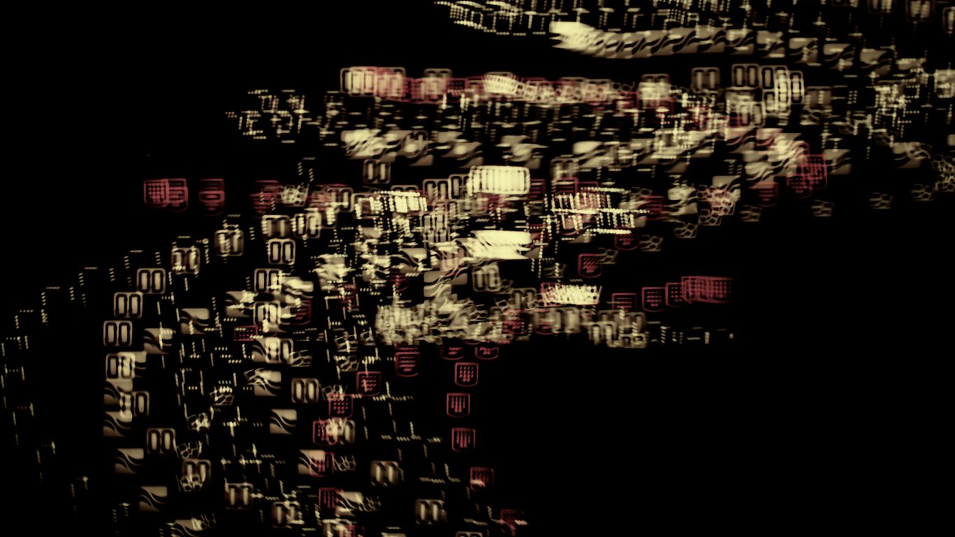
Indie Sleaze design is a style that really leans into the messy, the raw, and the unapologetically imperfect. It’s a throwback to the early 2000s internet and the energy of Tumblr pages. This aesthetic blew up in the mid-2000s, showing up everywhere from blogs and MySpace to posters and teen magazines. The whole point is that it’s not polished. It came about when people were just starting to figure out how to make their own blogs, designs, and posters without spending a lot of money. This led to a totally DIY look that actually celebrates imperfection.
Think of it as inspired by party culture, underground clubs, and a generation that loved snapping photos with cheap digital cameras and flip phones. It’s a style that feels real and unfiltered.
Let's break down the main elements that make this style stand out:
When it comes to fonts in Indie Sleaze, think bold and in-your-face. You’ll often see big, blocky headers with chunky text in all caps. It’s simple, but it’s loud. What makes it interesting is how these bold fonts are paired. Usually, a clean, sans-serif font is mixed with a smaller, more experimental font. This could be something that looks a bit grungy, like a typewriter font, or something distorted and funky that feels a little off. The main idea here is contrast. Nothing is too neat or perfectly matched because that polished, curated look wasn't the goal. Typography in this style is less about strict hierarchy and more about creating energy.
Forget glossy, professional photography. Indie Sleaze is all about low-quality visuals. Picture this: high flash, blurry shots, and images that are cropped in close. It’s meant to feel authentic, unfiltered, and real. The goal is to capture the vibe of sweaty dance floors, people caught in awkward poses, or just candid moments. It’s the total opposite of the posed, highly edited photos we see all over social media today. With this style, you actually want those little details that you’d normally edit out. Contrast is a theme here too, with dark, shadowy photos or washed-out images. The visuals should feel a bit jarring, and that’s on purpose. Look for movement, blurs, or even static.
Indie Sleaze design is the definition of thrown together, but in the best way possible. It’s a mix-and-match of different textures and prints colliding on the same page. You’ll see jagged edges, uneven spacing, text that doesn’t quite line up, and visuals that look like they were cut and pasted. This was the era of Photoshop collages and basic editing. Designers weren’t aiming for perfection; they were aiming for a vibe. This makes the style really fun to work with.
This design style is always people-oriented. It’s about community, friends, the party, and the scene. You’ll notice that these designs almost always feature people – dancing, hanging out, or just living life. It’s all about showing life, connection, and energy. This is probably why the style is finding new popularity today. We’ve reached a point where people are tired of highly curated content and perfect feeds. We want real and authentic, and this style delivers exactly that by capturing that messy, human, grungy aesthetic.
The early 2000s are really trendy right now, and Indie Sleaze fits right in. This type of imperfect design is getting more engagement and positive reactions on social media. It’s the rebellion against minimalism and overly created aesthetics that many people are tired of. Indie Sleaze is messy and imperfect on purpose, and that’s resonating with younger audiences. Plus, it’s giving millennials the nostalgia they crave. The best part? You can recreate this style quickly and easily, just like we saw in the quick design challenge. It’s a great way to embrace a looser, more expressive approach to design, perfect for flyers, social media posts, or even posters.
Your next phase of growth requires a focused strategy. Instantly quantify your potential return with our Marketing ROI Calculator.
You're paying for traffic, but 80% of leads go cold within 10 minutes. Download our Speed-to-Lead Architecture Kit (Calculators + Scripts) and fix your follow-up system today.
Includes the "Revenue Leak" Calculator & Copy-Paste Scripts.